Martha Uniacke Breen, Special to National Post

One of the advantages of designing Modernist houses is that, unlike with more restrictive, traditional styles, the designer is free to resolve challenges that arise during the process in novel and often highly creative ways. That’s part of what makes the interior design of this Oakville home, by Harmen Design principals Goli Basiri and Kia Kazemian, so interesting.

The clients had owned an older home on the lot, which was no longer working for their family. With four growing kids, all sports enthusiasts, storage for their gear had become an ongoing problem. The house was too small for the quite sizeable lot, even with an existing pool in the back yard. The couple had an educated eye for modern design and innovative materials, and the whole family are dedicated cooks and love to entertain. So the decision was made to raze the old house and replace it with a larger, modern home.

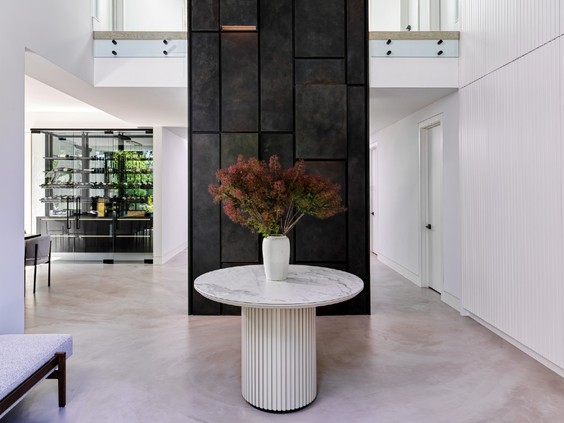
Working alongside architect Josh Theriault of Fine Lines Architecture and the builder, Taylor Day of Day Custom Homes, the designers began with anartistic flourish thatappears the moment the front door is opened: a double-height feature wall that soars past a second-storey mezzanine to the roof. “They wanted some kind of wow factor in the foyer, so our fabricator came up with what is really a sculpture,” says Kazemian.
Finished in charcoal-tinted micro-cement infused with metallic powder, the wall consists of a series of staggered rectangles of varying lengths and planes, with recessed lighting incorporated here and there for an ethereal effect. As Kazemian explains, micro-cement is a newer material, invented in Europe and rapidly growing in popularity in North America, with a highly durable, almost Venetian plaster-like finish. It was also used in the flooring on the main level. “It has a beautiful, very smooth texture, without seams or lines like you get with tile or even concrete, and you can custom-tint it to any shade, like paint,” explains Basiri.
The challenge was to make the rest of the foyer functional and attractive without stealing focus from the feature wall. The solution was to keep everything else clean and low-key. To one side, double-height banks of cupboards with simple grooved fronts conceal storage for everything from coats and boots to out-of-season items and more. On the other side is a custom-designed bench, cozily upholstered in sherpa fabric with wood accents, placed beneath an irregular, oval-shaped mirror, adding an organic note among all the lines and squares. A custom table in the centre of the room with a fluted base that echoes the grooves of the cupboard completes the composition.
Walk around behind the feature wall, and its raison d’être comes into focus. “Because it’s a big house, we didn’t want the staircase to be the first thing you see when you come in,” explains Kazemian. “So we turned it around and used the feature wall to hide it.”

The staircase is not without artistry of its own; it’s almost devoid of bolts, seams or even any visible joinery. “We recessed the glass railings into the floor so you can’t see the supports, and the fasteners for the treads are concealed inside wood blocks on the outside of the glass railings,” he points out. Even the handrails are limited to the inside railings and are whisper-thin; the entire mechanism seems to float in air.
The rest of the main-floor rooms unfold around the foyer feature wall like spokes from a hub. To the left is the dining room, dominated by a custom walnut table that seats 12, paired with warm grey upholstered chairs with reeded backs for a discreet shot of texture. It’s so large that two identical hanging light fixtures were required to illuminate it. A built-in “wine cellar” takes up one side, with a smoked mirror backing to add sparkle and a sense of depth. Placing it here, rather than down in the basement, is convenient and adds a focal point.
But perhaps the most interesting feature in the dining room is a set of four hand-blown Tafla mirrors from the European studio Zieta that resemble giant drops of liquid mercury against the pale grey wall.
In the kitchen, the challenge was what to do about the room’s 10-foot ceilings. Elegant as they may be visually, from a practical point it meant the top tier of cupboards was inaccessible without a ladder or stepstool. The solution was a high-techluxury: motorized cabinets that open and descend at the push of a button. It was an investment, saysBasiri, but has become one of the family’s favourite features.

The thorniest challenge in the interior arose when it came time to design the family room. “We wanted the fireplace to be exactly in the centre of the side wall,” Basiri explains, “but there was this very large bulkhead running along the ceiling at one side that threw everything off.”
The only solution was to make the awkward bulkhead a feature. A matching column in the same dimensions was built into the wall under the bulkhead, creating a shallow alcove; recessed lighting around the edges added an extra measure of coziness. Finally, the fireplace was moved to the centre of the new, slightly shorter wall. The result is a well-balanced vignette, and a welcoming perch for family TV nights.

The final notable challenge came in the primary bedroom. “The husband in particular really wanted a lot of grey and dark monochrome tones,” Basiri says, “but we felt that would be too cold, too commercial-looking, and we wanted to warm it up.” The warmth came in the form of hardwood floors, pale upholstery and walls, and soft recessed lighting. Then a wide upholstered leather headboard was specified to run the entire length of the wall behind the bed. Only problem: no place for outlets or light switches.
Article content
“The building code specifies you can’t install electricals directly on a fabric or leather surface. So we decided to create a narrow dark-stained panel below the padded headboard and put the switches and outlets in that.” It also makes a nice backing for additional built-in storage cubes on either side of the bed.
“The clients love modern design and had clear ideas, but they trusted us enough to come up with the details, which was an honour,” says Basiri. “And we’re really happy with how we were able to solve the problems that come up during the process, all through the house.”
